UX/UI Design
bougie bread
UX designer leading the bougie bread app and website design
Role
Conducting interviews, paper and digital wireframing, low and high-fidelity prototyping, conducting usability studies, accounting for accessibility, iterating on designs and responsive design.
Responsibilities
January - March 2024
Timeframe
Project overview
The web and mobile app is designed to facilitate safe and convenient ordering for users, tailored to cater customer’s needs, particularly those with allergies. The products primary aim is to ensure a safer and more accessible order experience from the bakery.
Objective
The primary objective of this project was to design an app to streamline the bakery ordering process, ensuring efficient orders while minimising allergy/nutritional concerns. As a part of this goal, the app prioritises a user-friendly interface that provides detailed nutrition and ingredient information for a seamless experience.
User research
Through interviews, combined with quantitative surveys, I gathered a better understanding of our target audience’s needs.
Many expressed that they had encountered situations where they received incorrect orders, some even containing allergens despite clear specifications or product descriptions. This has turned what should be a simple and easy experience into a frustration, completely defeating its original purpose.
Users further expressed a desire for a safe and hassle-free ordering experience with features that would ensure a minimising of allergen/nutritional concerns. This finding shifted the focus to optimise the app’s usability and seamless ordering experience.
Pain point
1
Users encounter challenges when attempting to order baked items that is not allergy labeled or has not any nutritional information.
Pain point
2
There are common frustrations amongst the users when the baked items they receive differ from what they placed in their cart.
Pain point
3
Users often experience frustrations having to re-enter card number every time they re-purchase.
User persona
Based on the interviews that were conducted, a user persona was created to represent the target audience for the app, informing the design decisions and helping to focus efforts and build empathy.
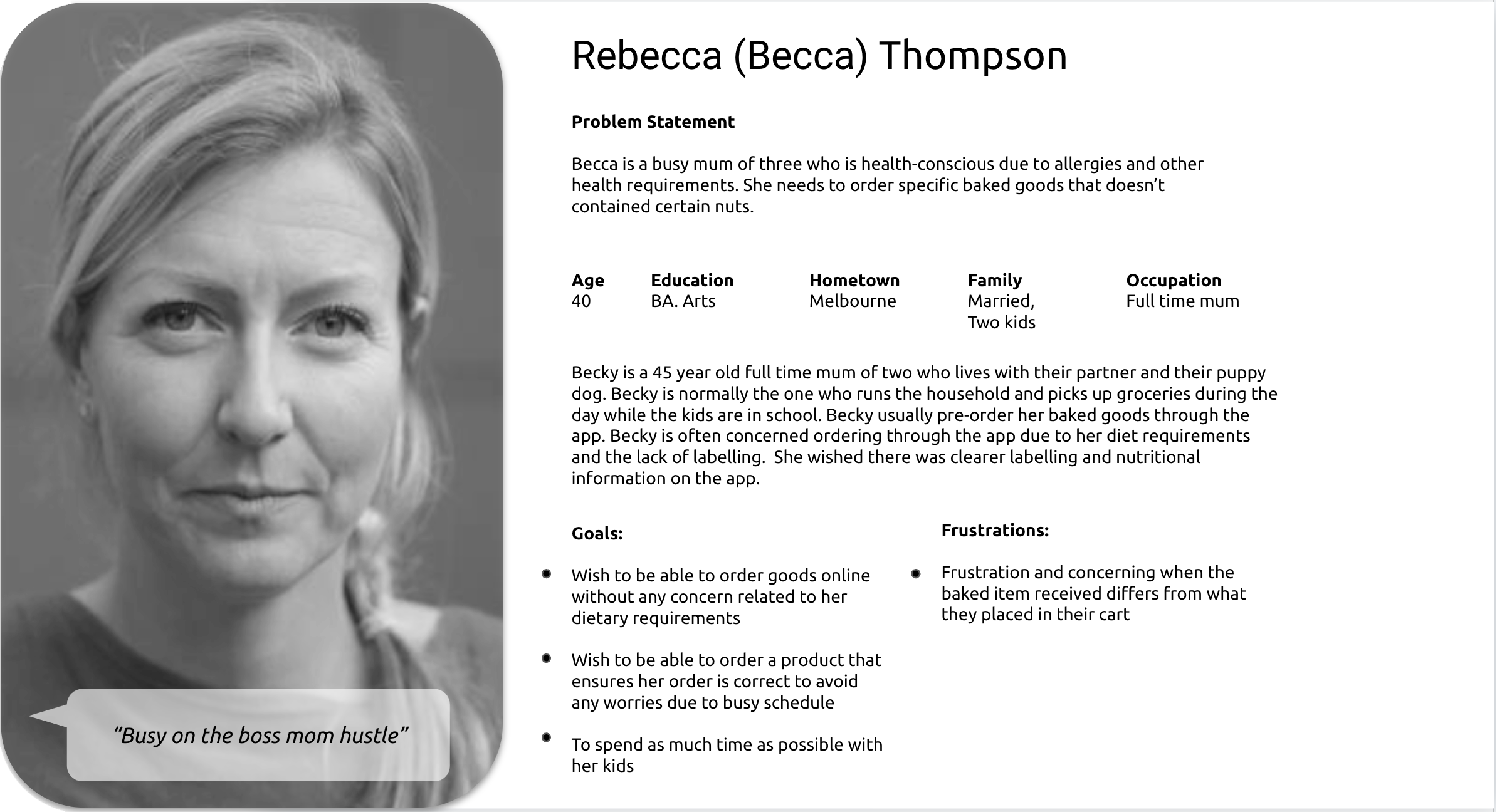
Impact on design decision
Through interviews, combined with quantitative surveys, I gathered a better understanding of our target audience’s needs.
Many expressed that they had encountered situations where they received incorrect orders, some even containing allergens despite clear specifications or product descriptions. This has turned what should be a simple and easy experience into a frustration, completely defeating its original purpose.
Users further expressed a desire for a safe and hassle-free ordering experience with features that would ensure a minimising of allergen/nutritional concerns. This finding shifted the focus to optimise the app’s usability and seamless ordering experience.
Clear Allergen Labeling
Bougie Bread provides transparent allergen information for each product, ensuring users like Becca can make informed choices.
Personalised User Experience
The app learns and remembers the user's preferences, streamlining the users future searches and suggesting tailored options.
Accessibility
The app has a well-designed interface with clear navigation and accessibility features ensuring a usable and enjoyable experience for a wider range of users.
User flow
Recognising the challenge users face in navigating an app or a website, particularly concerning dietary needs,
I created a clear sitemap prior to creating the wireframes.
My objective was to enhance the overall navigation, ensuring that users could easily find what they need.
The structure prioritises simplicity and ease to use, mirroring the commitment bougie bread is catering to its customer.

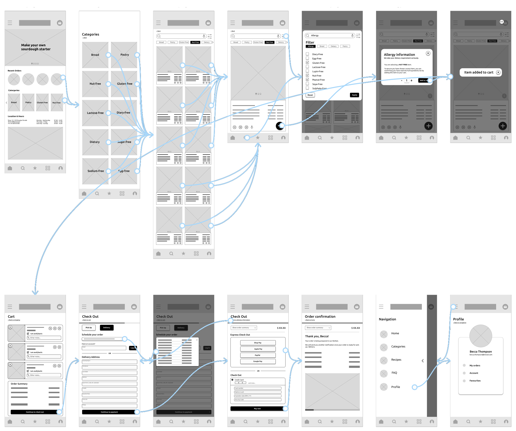
Lo-Fidelity Wireframes
I created the low-fidelity prototype by linking all the screens needed for the main user flow of adding a product to the cart, while at the same time ensuring and empowering the user that they have chosen a suitable product for their needs, prior to completing the checkout process.
During this phase, I gathered feedback from other users, such as button placement and page layout according to how they experienced the main user flow.
I carefully considered their feedback and incorporated their suggestions aimed at resolving user frustrations.
Style guide
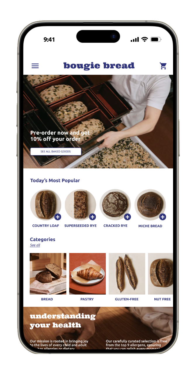
The darker blue hue in the bougie bread app’s colour palette not only signifies premium quality, luxury ad tradition, but also reflects the app’s dedication to reliability in meeting customers’ dietary needs and ensuring the highest quality and safety.
#33307E
#E8EAEB

#FBFBFB
#FFFFFF
Screen designs
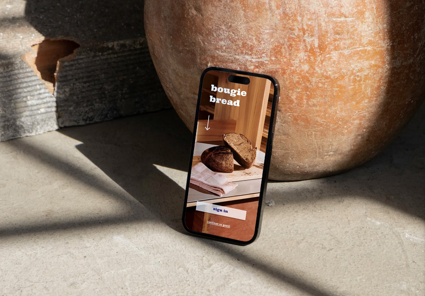
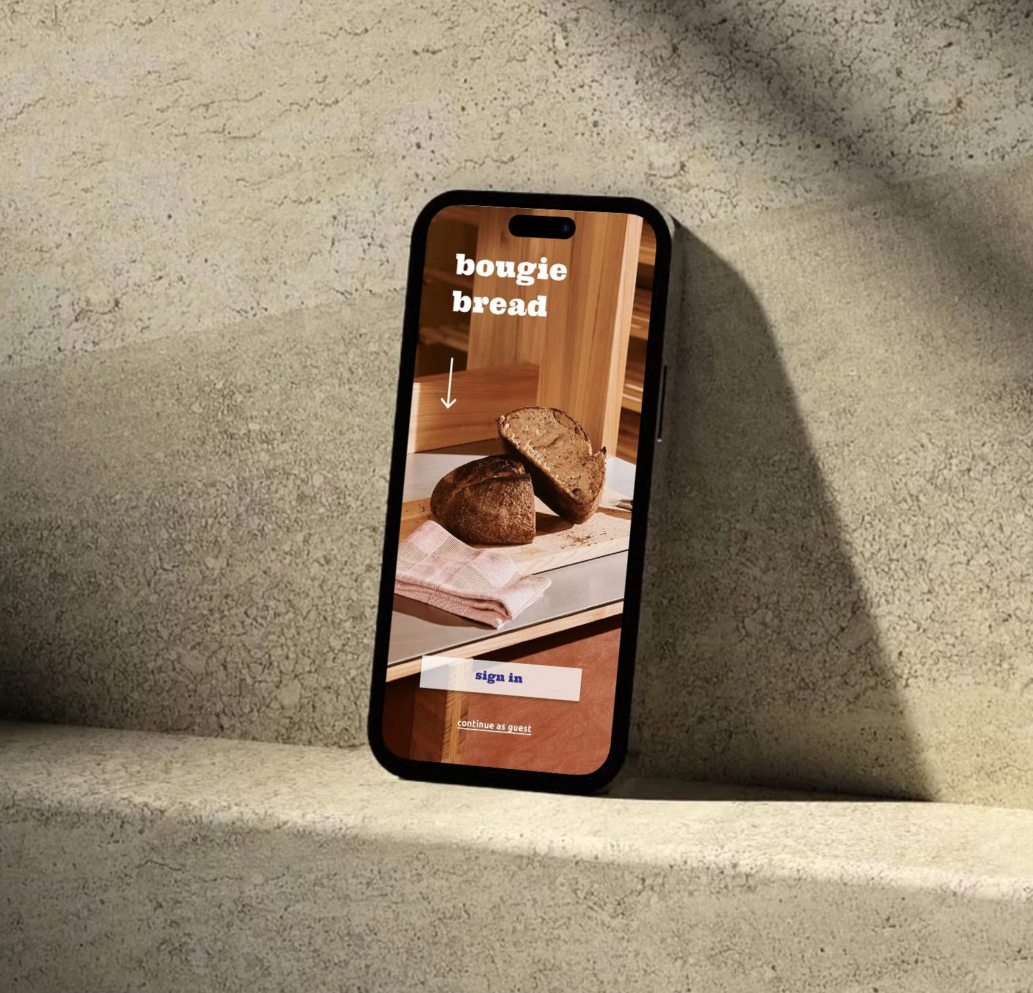
Homescreen
User-centric design that highlights the sophistication of bougie bread’s offerings while ensuring an intuitive navigation experience for effortless browsing and ordering.
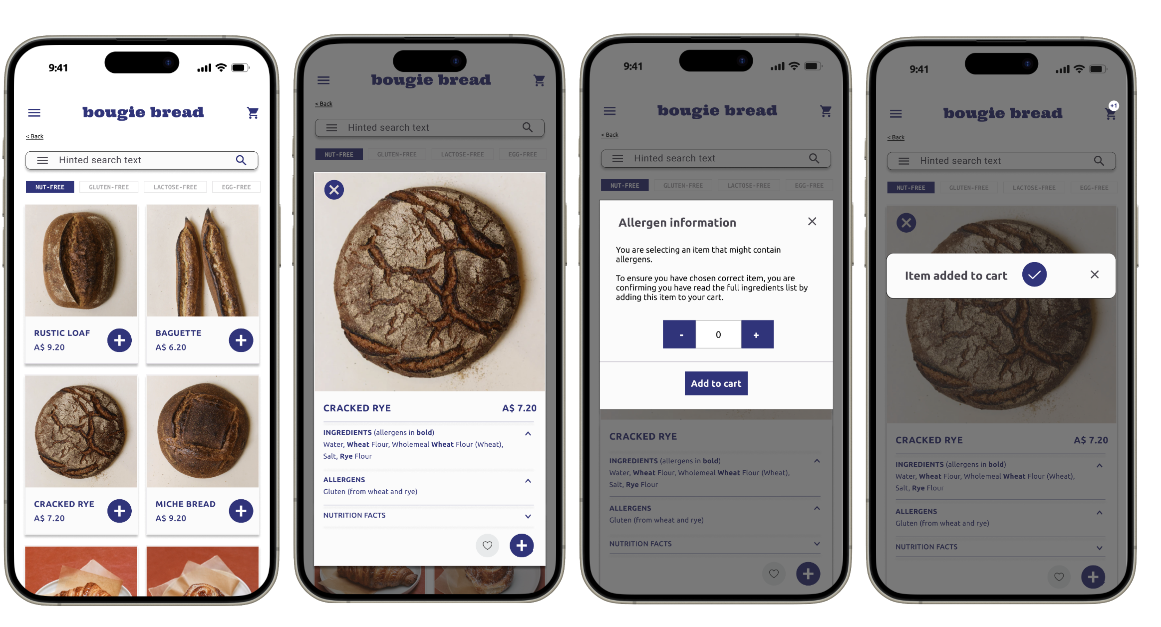
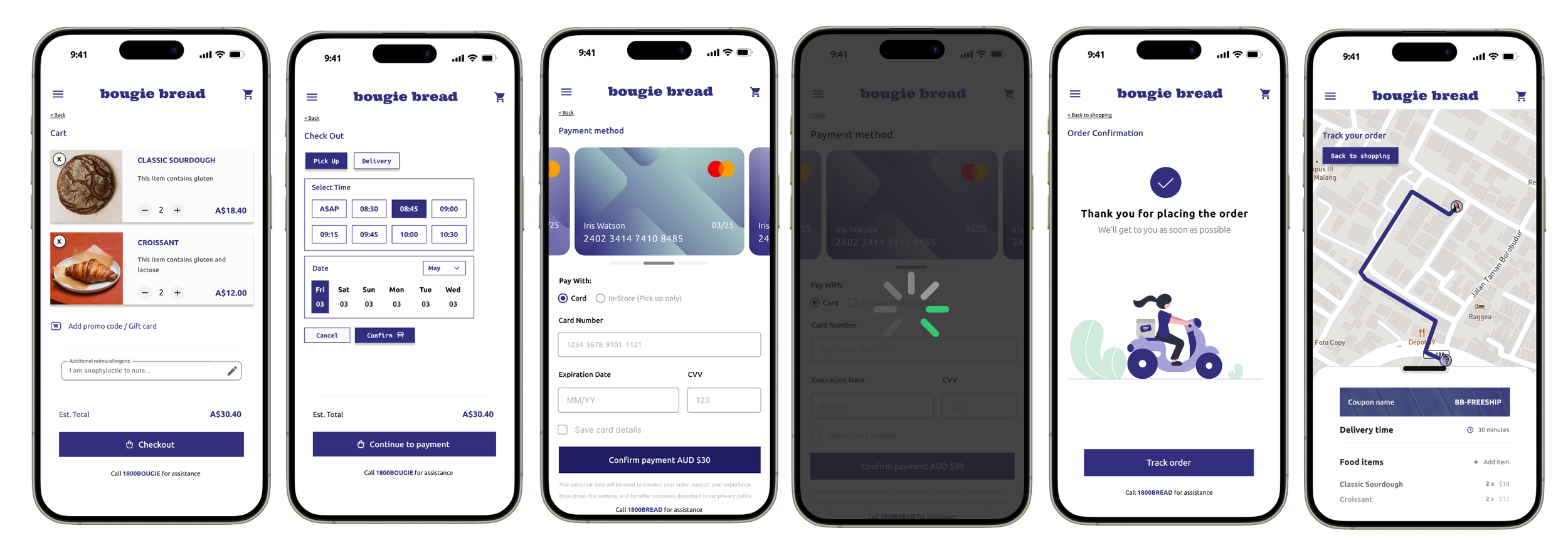
Ordering process
Employing the dark, royal blue for engagement, a toned grey for visual comfort, and white for clarity, guiding users through a seamless process with clear and concise ordering process, ensuring the customer a concern-free user experience, reassuring with clear labelling and nutritional information prior to placing the product to cart.