UX/UI Design
spare plate
UX designer leading the ‘spare plate’ app and website design
Role
Conducting interviews, paper and digital wireframing, low and high-fidelity prototyping, conducting usability studies, accounting for accessibility, iterating on designs and responsive design.
Responsibilities
March - May 2024
Timeframe
Project overview
The mobile app is designed to connect communities by redistributing surplus food from local businesses and households to those in need. Combating food insecurity and waste fosters empathy and solidarity. The products primary aim is to bridge the gap between abundance and struggle, ensuring no one goes hungry.
Objective
The primary objective of this project was to design an app to unite communities by redistributing surplus food from businesses and households to those in need. Through an intuitive user-centric platform, it fosters empathy and unity, ensuring no one goes hungry or feels ashamed, while bridging the gap between abundance and struggle.
User research
Through user interviews, I sought to gain a better understanding of the challenges faced by individuals in urban environments. Insights revealed a pervasive sense of isolation despite living closely, exacerbated by widening financial disparities leading to food insecurity for many households. Surplus food from businesses and homes highlighted the disconnect, indicating a pressing need for community-building solutions like ‘spare plate’.
Pain point
1
Barriers and availability
Users frequently encounter obstacles in accessing surplus food due to logistical barriers or limited availability, further exacerbating their financial struggles and perpetuating food insecurity in urban areas.
Pain point
2
Embarrassment
Many users experience feelings of shame and embarrassment when they are unable to adequately provide for their families and resort to seeking surplus food, as societal stigma and judgement associated with food bank usage perpetuates the sense of inadequacy.
Pain point
3
Food waste
Users report that they are struggling to make ends meet in the face of soaring living costs while witnessing the wasteful disposal of perfectly good food by local businesses and more fortunate households
User persona
Based on the interviews that were conducted, a user persona was created to represent the target audience for the app, informing the design decisions and helping to focus efforts and build empathy.

Impact on design decision
Through interviews, combined with quantitative surveys, I gathered a better understanding of our target audience’s needs.
We believe that by providing a user-friendly platform that connects the user with surplus food in their community, spare plate can empower the user to access affordable meals and groceries, eliminating food waste and fostering a sense of solidarity within her community.
In essence, ‘spare plate’ seeks to provide users with a reliable and efficient solution to their food insecurity, while also fostering a sense of community and support to help them through difficult times.
Efficiency and Confidence
‘spare plate’ eliminates the frustration and uncertainty of food insecurity and waste, offering an efficient and confidence-inspiring solutions for users like Lisa.
Community Support
By connecting users with surplus food from local businesses, Spare Plate fosters a sense of solidarity and support within communities, ensuring that everyone has access to nutritious meals while reducing food waste.
Intuitive User Experience
‘spare plate’ offers an intuitive platform with features such as search function, categories for easy navigation, and personalised recommendations based on user preferences. The app has a well-designed interface with clear navigation and accessibility features ensuring a usable and enjoyable experience for a wider range of users.
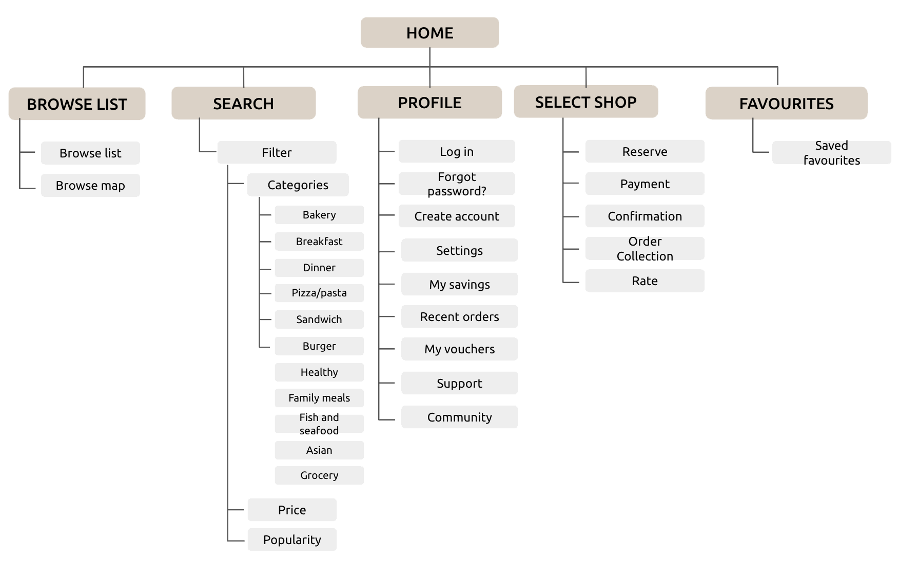
User flow
Recognising the challenge users face in navigating an app or a website, particularly concerning dietary needs,
I created a clear sitemap prior to creating the wireframes.
My objective was to enhance the overall navigation, ensuring that users could easily find what they need.
The structure prioritises simplicity and ease to use, mirroring the commitment bougie bread is catering to its customer.
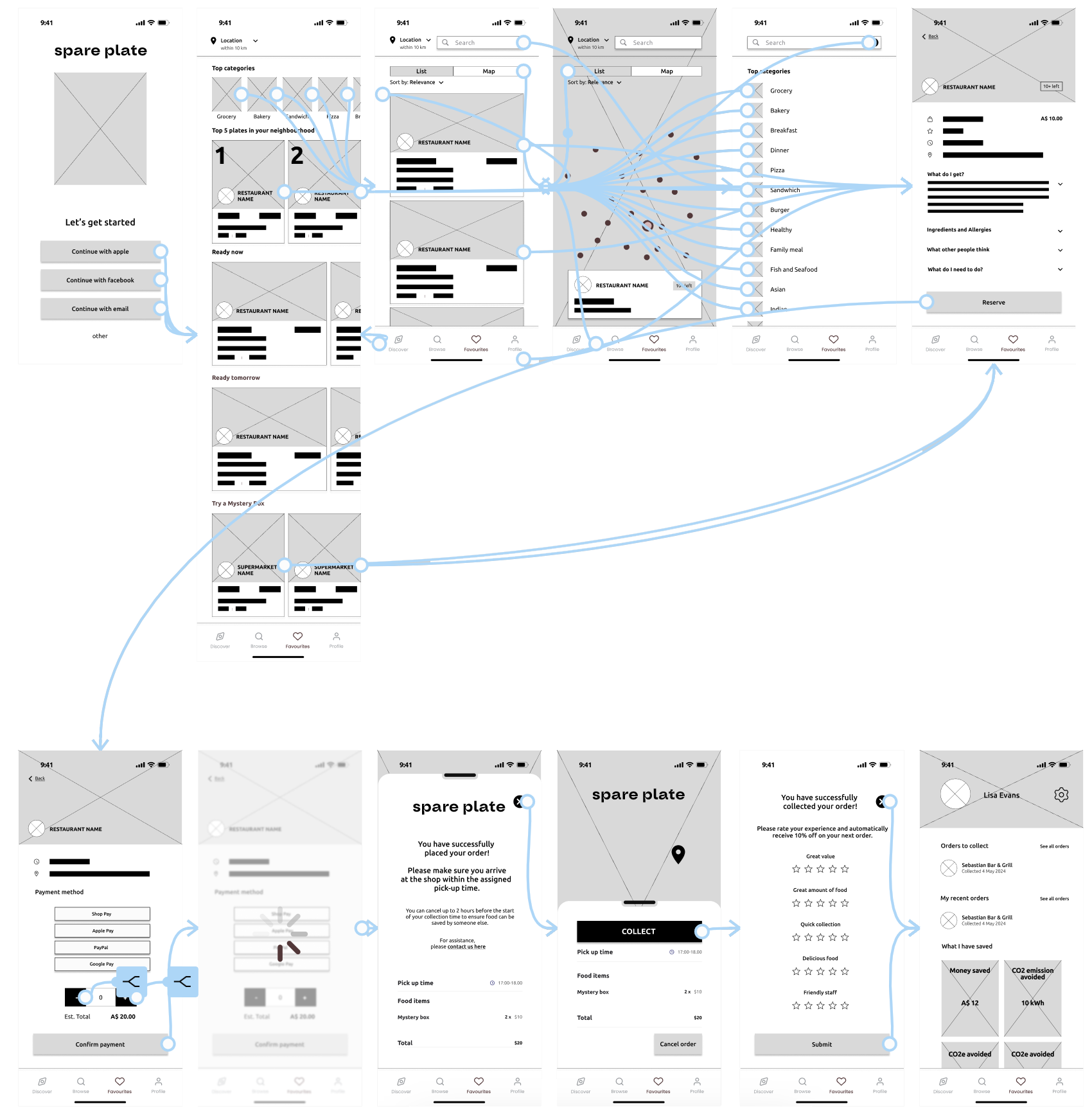
Lo-Fidelity Wireframes
I created the low-fidelity prototype by linking all the screens needed for the main user flow of adding a product to the cart, while at the same time ensuring and empowering the user that they have chosen a suitable product for their needs, prior to completing the checkout process.
During this phase, I gathered feedback from other users, such as button placement and page layout according to how they experienced the main user flow.
I carefully considered their feedback and incorporated their suggestions aimed at resolving user frustrations.
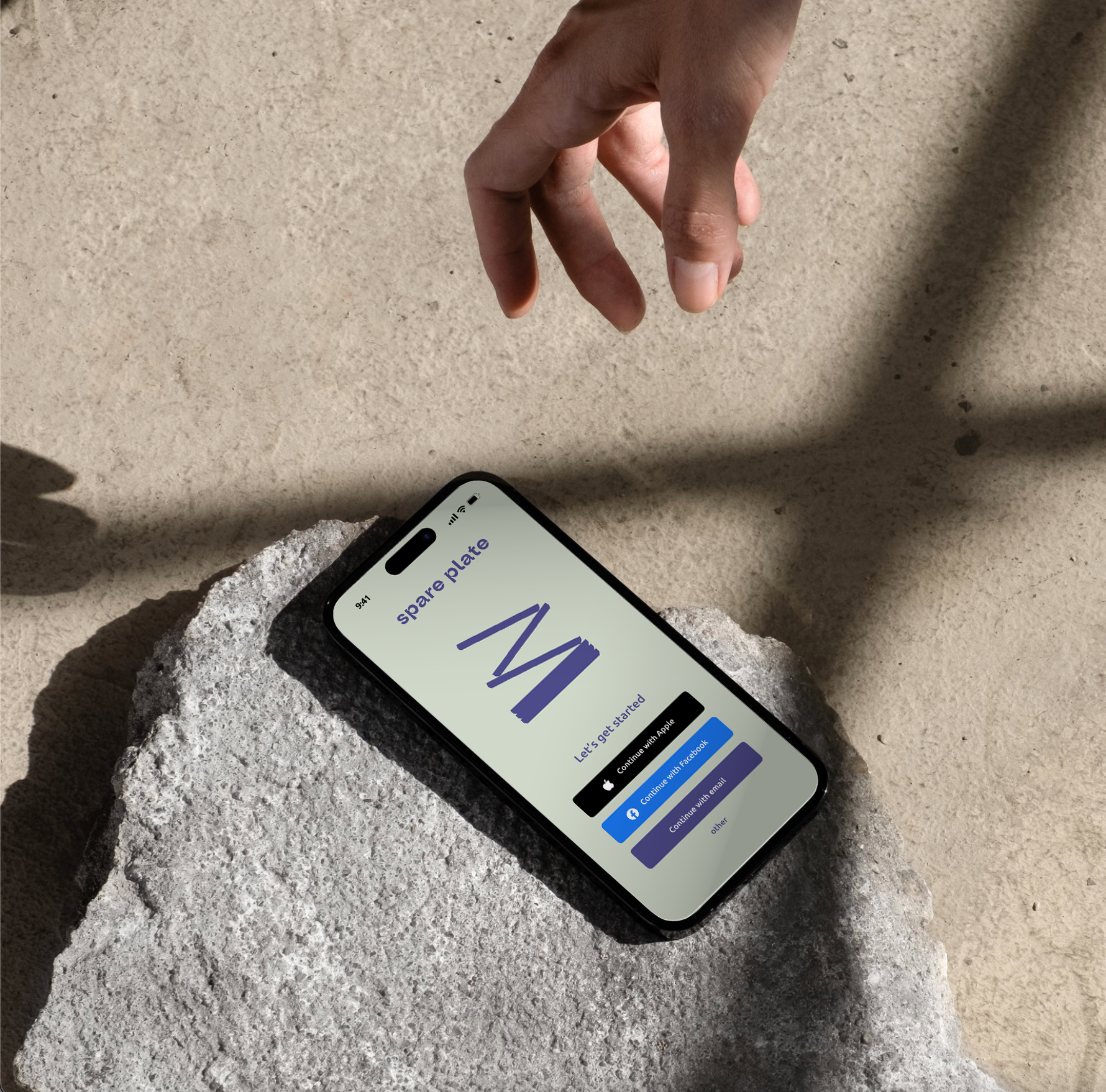
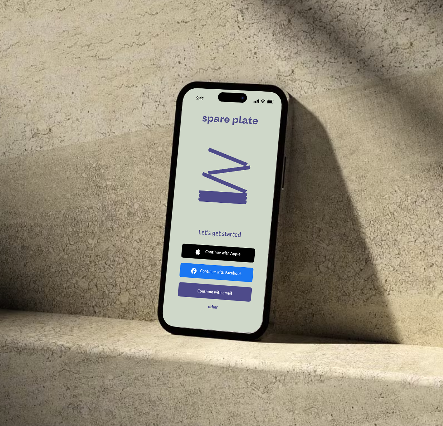
Style guide
The muted sage green colour with an earthy tone evokes a refreshing and calm sophistication. It represents the renewal and abundance in a circular economy, manifesting spare plates vision of bridging the gap between abundance and struggle, ensuring no one goes hungry.
The darker blue colour adds an engaging and user-intuitive experience, with a white background for clarity to ensure colour contrasting and accessibility.
#ECF0EA
#4E4B8A
#CFD9C9
#FFFFFF

Screen designs

Homescreen
User-centric design that highlights the sophistication of ‘spare plate’s’ offerings while ensuring an intuitive navigation experience for effortless browsing and ordering.
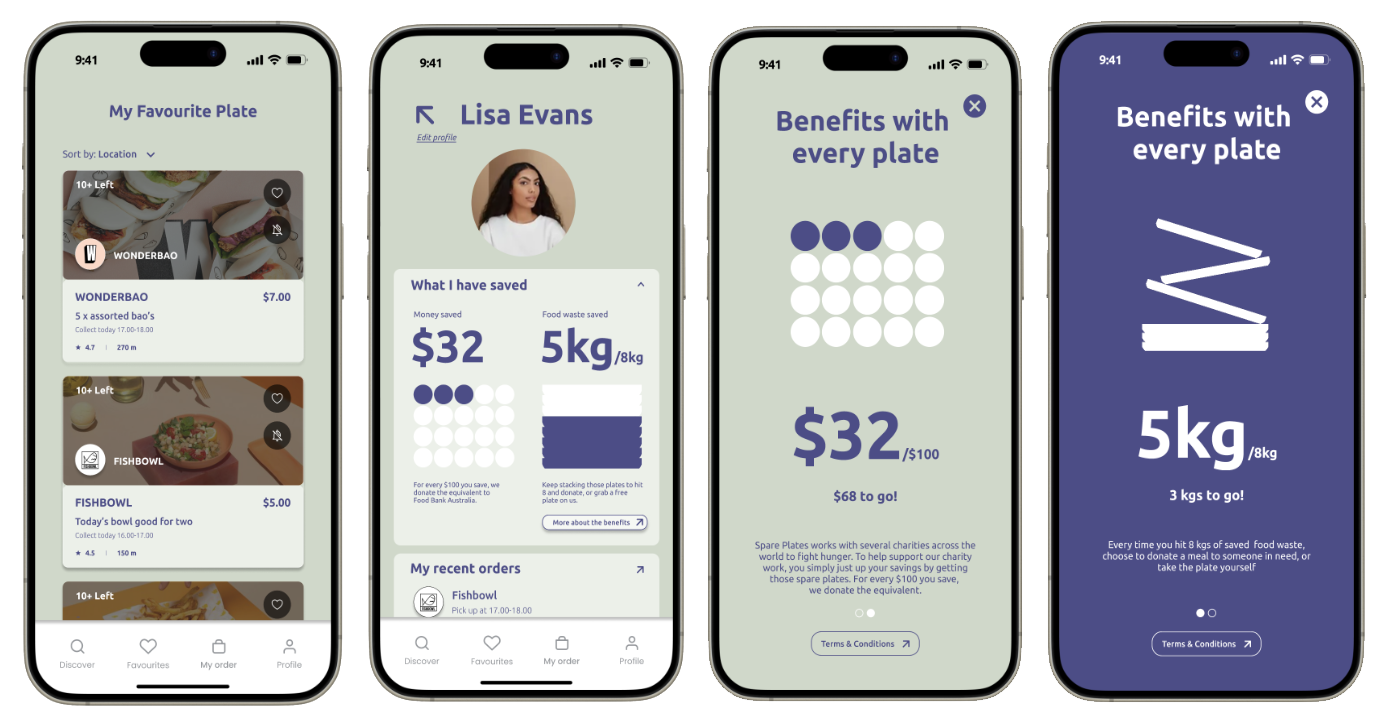
My profile
‘My profile’ is designed to be engaging and act as the compass for navigating your own savings and learning how to benefit from it.
The profile page also acts as a dashboard for your order history, your vouchers, support and community.
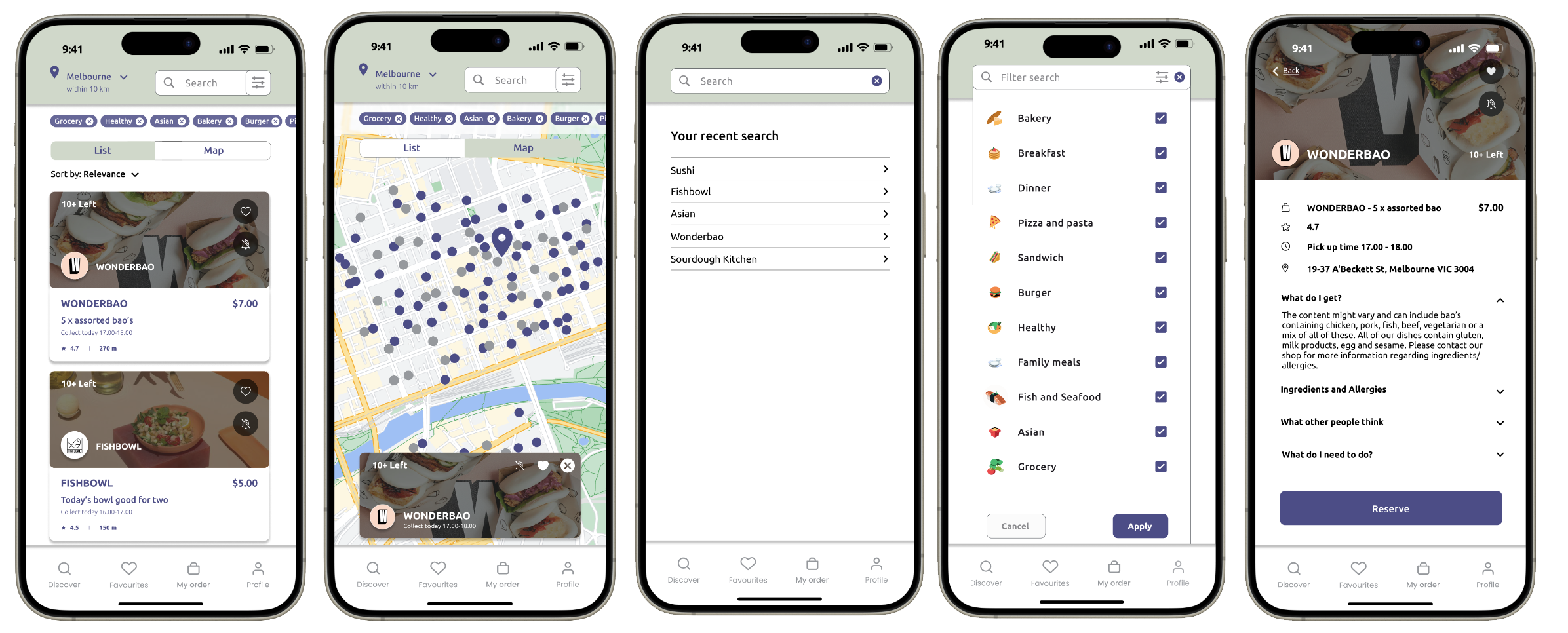
Browsing experience
Based on the user-research, insights found that the browsing experience was an important factor to the design of the app. Being able to intuitively navigate through listing, map, categories and search function without making it confusing was a challenge, but after several iterations, the users found the latest prototype to be a great user experience.
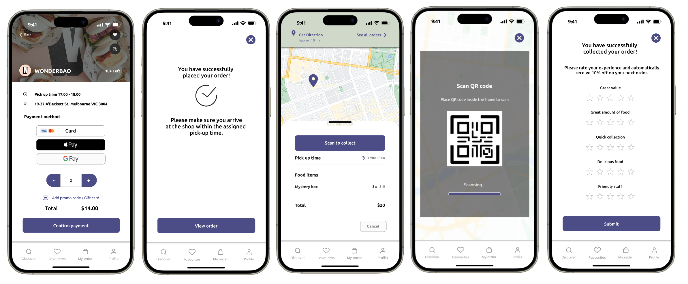
Ordering process
Due to the app facilitating left-over food, the user are expected to collect their order at the chosen premises. To collect the order, the user has to scan a QR code at the shop to confirm the collection.
At the end of the collection, the user is encouraged to give the shop a rating to help other users to evaluate if the shop is great or not.